Dr.Talk Online Medical education platform
2021, Medical education platform, Taipei
Why did we start this project?
At present, Taiwan does not have a comprehensive education platform dedicated to doctors, so doctors and medical students spend a lot of time on different platforms to find the materials and courses they need to learn, so we hope to solve a pain point.
Overview
This project is a 2.0 revision of the existing platform. In addition to adding new functions to the platform, the UI and UX were completely overhauled to match the customer’s brand.
DELIVERIES
Concept development
UX strategy
Wireframes
User experience
User interface
TEAM MEMBER
Thomas Lai, PM
Sean Wang, UX designer
Judy, System Architect
Vian, QA
Giant / Jeff / Gary, Developer
ROLE
UI/UX designer
DATE
June 2021 - Jan 2022
Design Process
Users Archetypes.
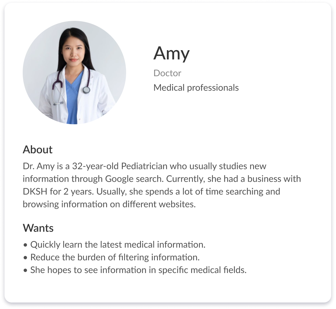
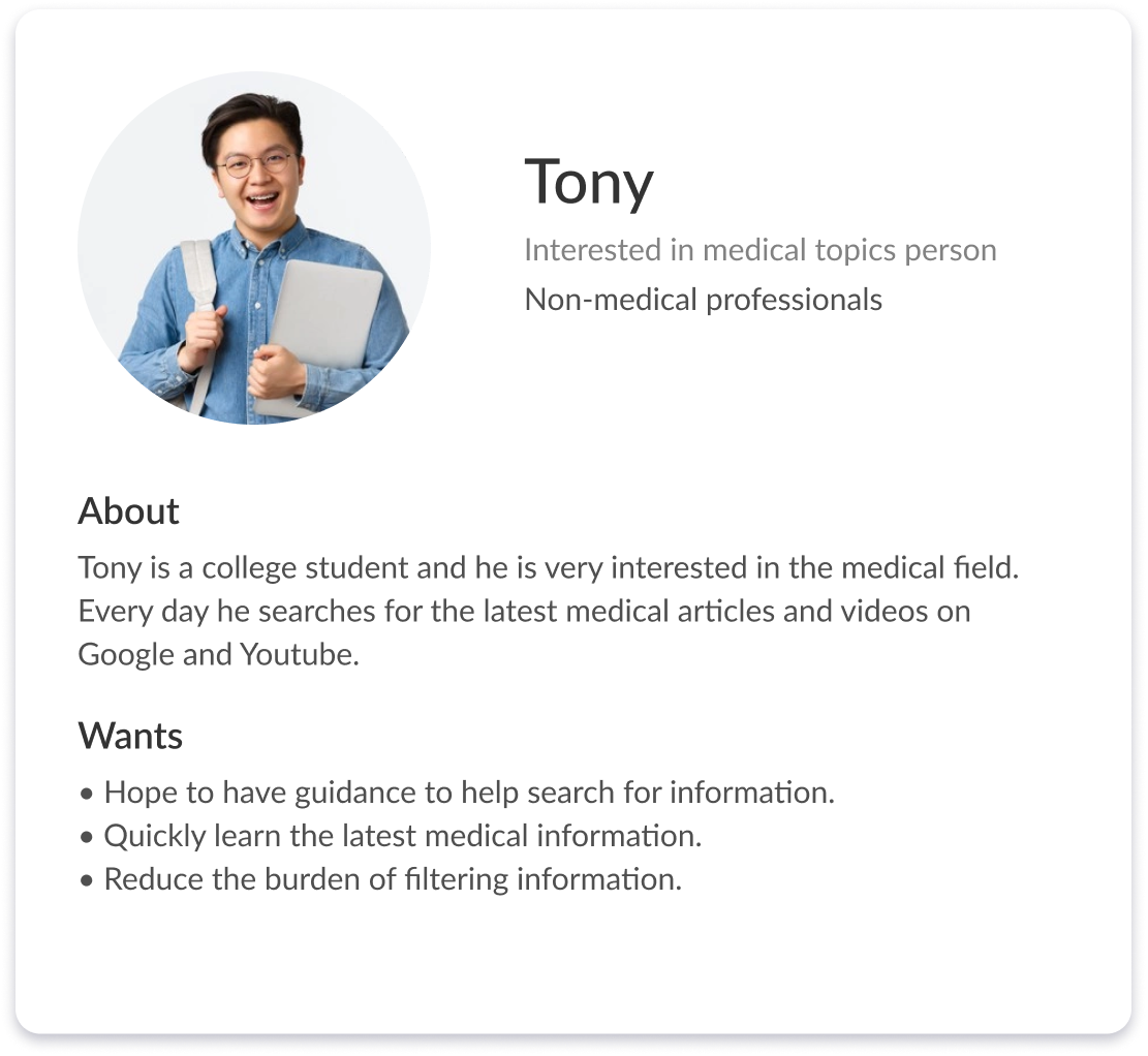
Based on stakeholder interviews with 6 people who worked at DKSH IT/Marketing, we basically divided our website users into 2 groups: Medical professionals and Non-medical professionals, as these 2 types of people behave differently and also have different goals. Both of them are interested in having a digital space to share or access medical knowledge. Also, they would like to have a place make networking easier.
The Challenge
Users with a diverse background
This project involves many users with diverse backgrounds, including medical professionals and non-medical professionals. Even though they are all interested in medical knowledge, their perspectives are different. We should consider the various perspectives.
Web pages are not easy to browse.
Both users want to quickly find any medical resources on the DKSH website. However, the 1.0 revision website is mostly statics and has poor navigation.
Ideation.
Provide corresponding content according to different roles and situations, and narrow the distance of medical content through design to create an online learning platform that can be easily explored.
Users with a diverse background
Information collation, friendly visual design.
Web pages are not easy to browse.
Strengthen exploration methods and visual guide.
Wireframes
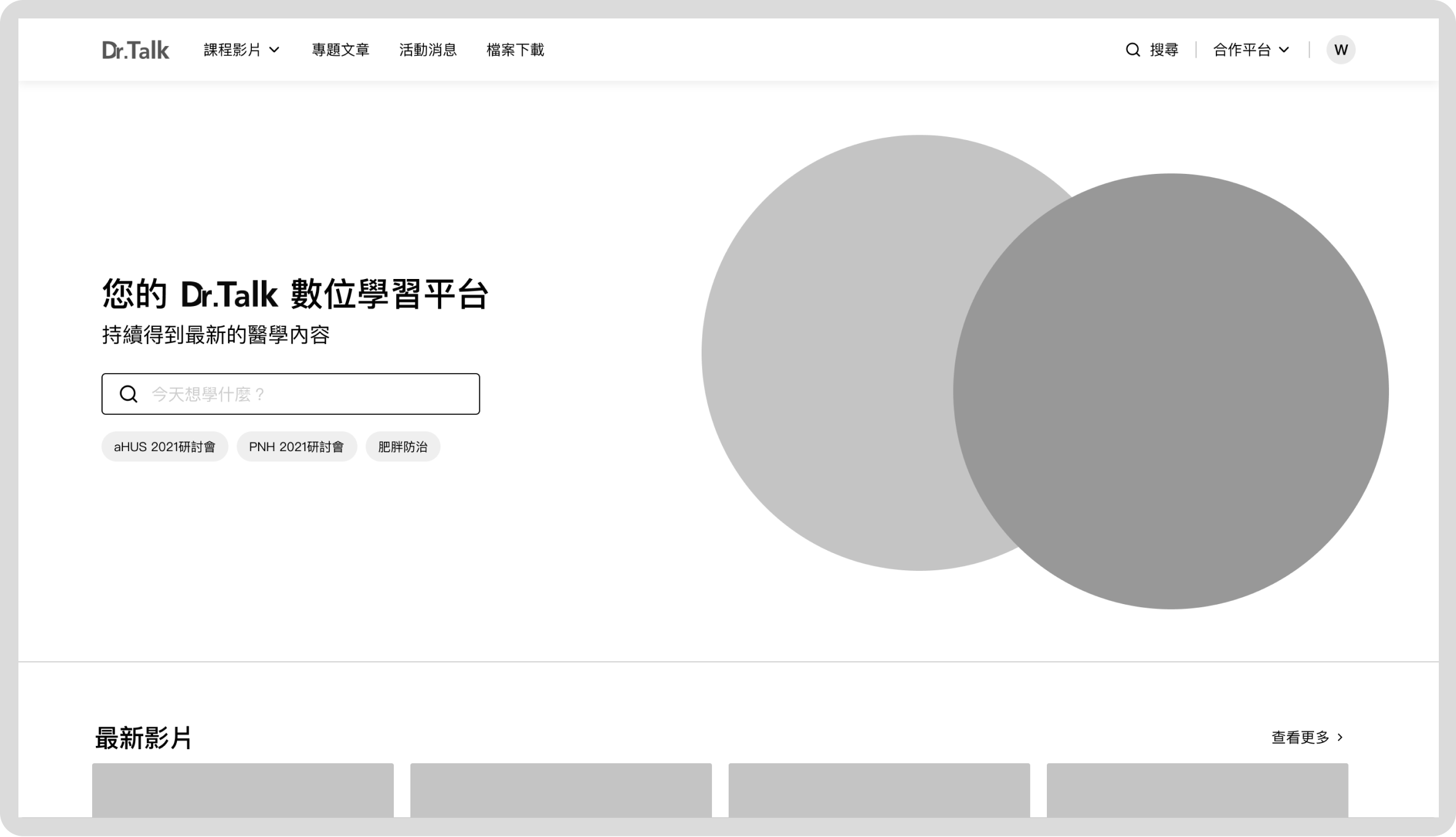
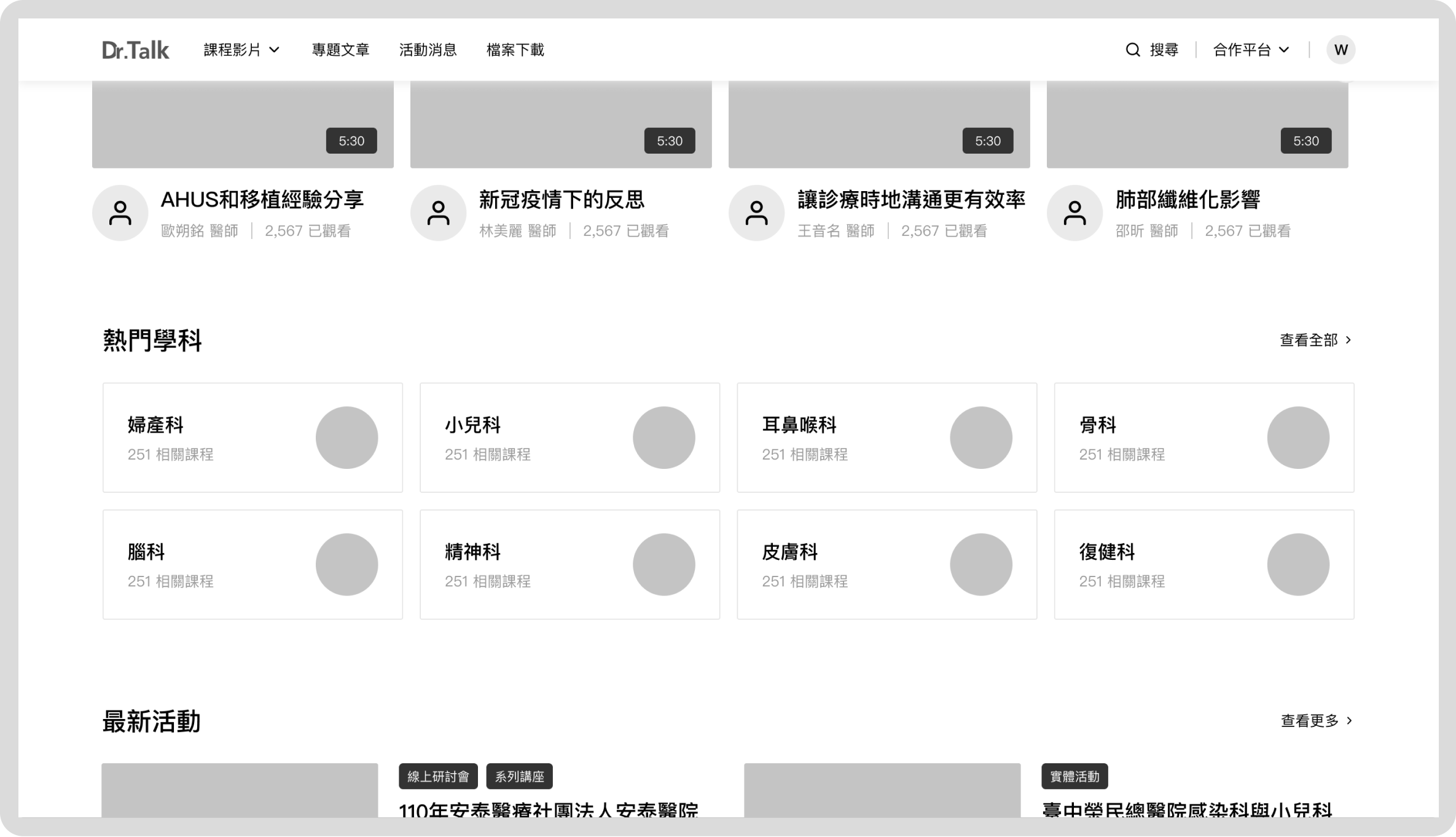
At this stage, we used wireframes to discuss with our stakeholders and better understand what kind of information they want to know about. We created the Wireframes based on the information architecture.
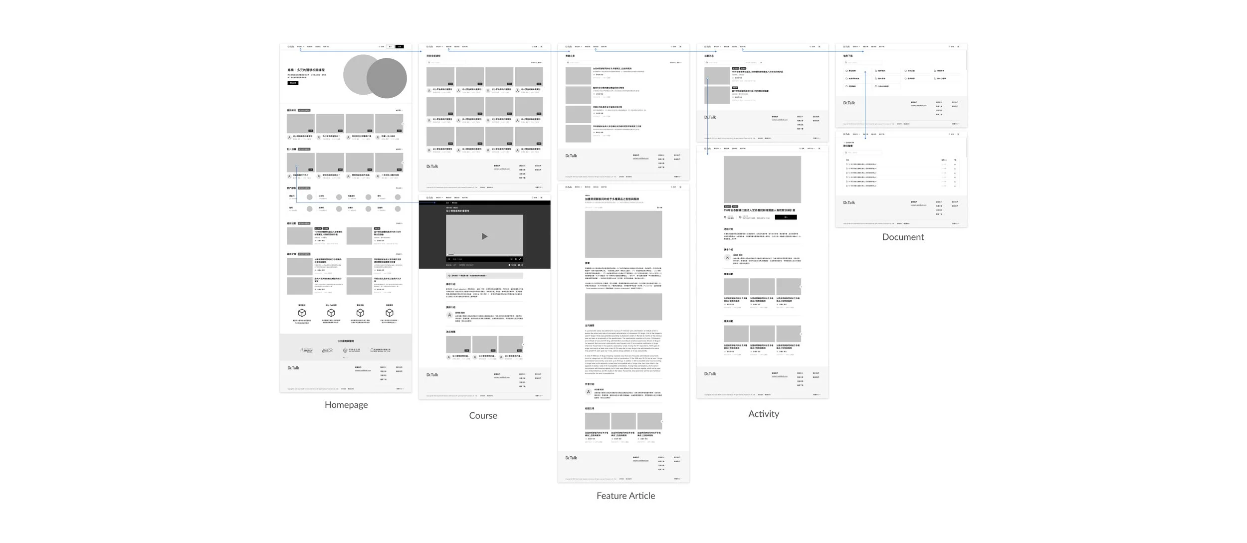
Challenges when creating wireframes
For example, when they are inquiring about data, what sorting method is used to make it easier for them to find the medical information they are interested in. As a result, at this stage, after we confirmed the info on the wireframes, we move to the next stage, UI design.
Through interviews, we found that most users are accustomed to searching through keywords, so we decide to put keyword search at the top of the homepage after login.
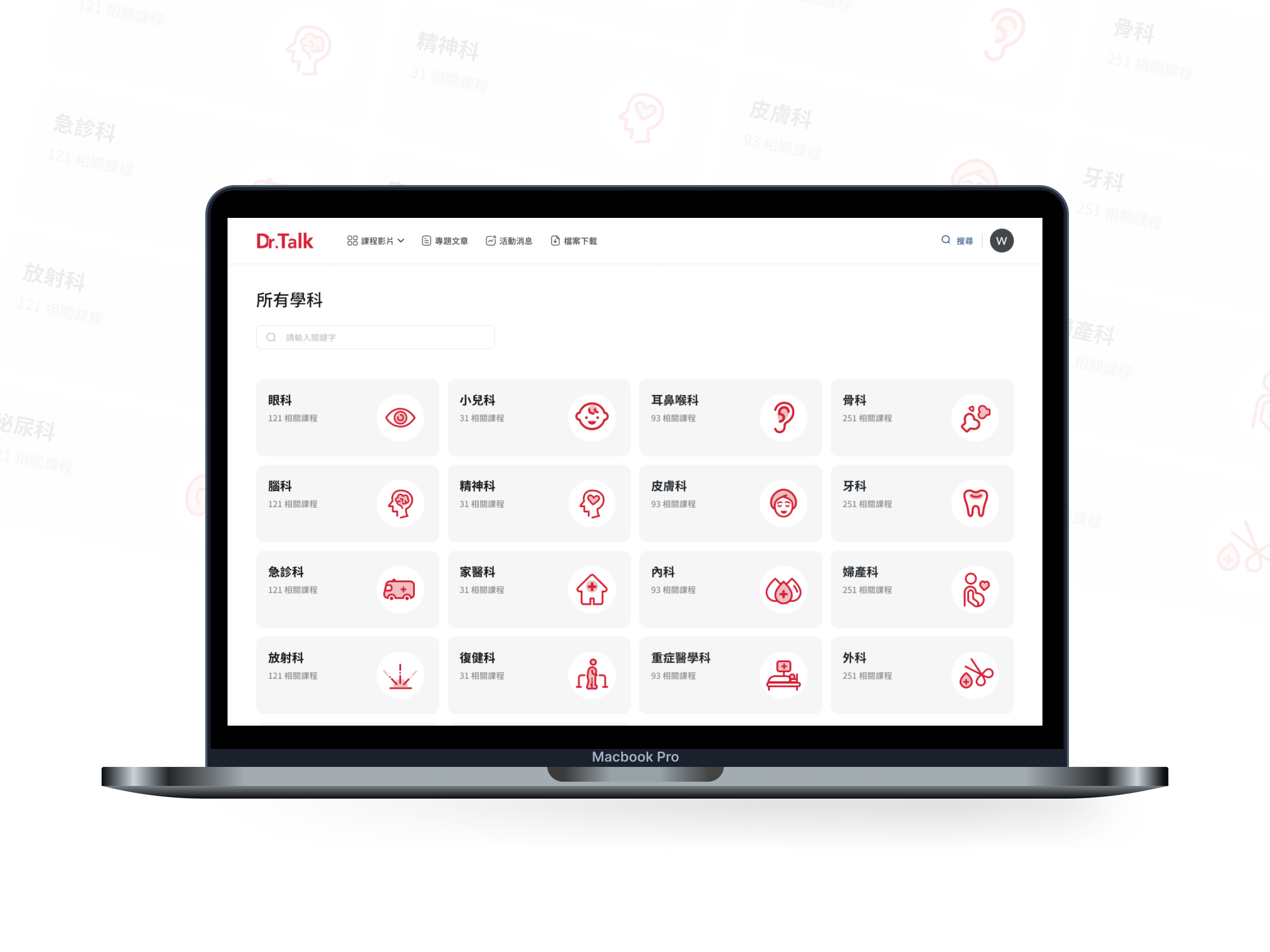
Through interviews, we found that users are accustomed to exploring the learning content of interest through medical categories, so I designed for users to explore through subjects.
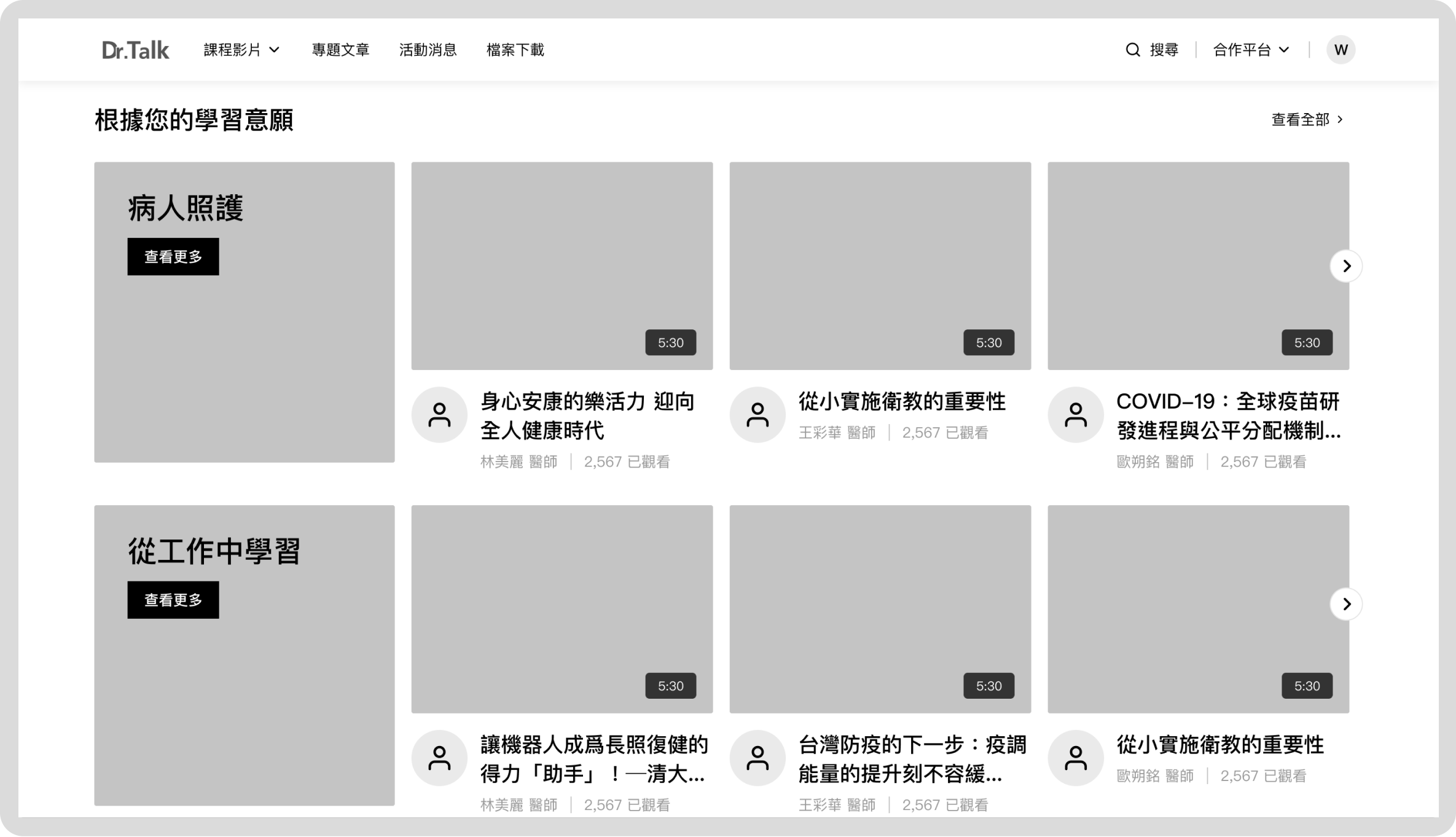
Based on the findings in the focus group session, we found that our users are interested in customizing their home page according to their interests. So I designed a learning willingness process for them to choose their interested Study topics.
UI Strategy.
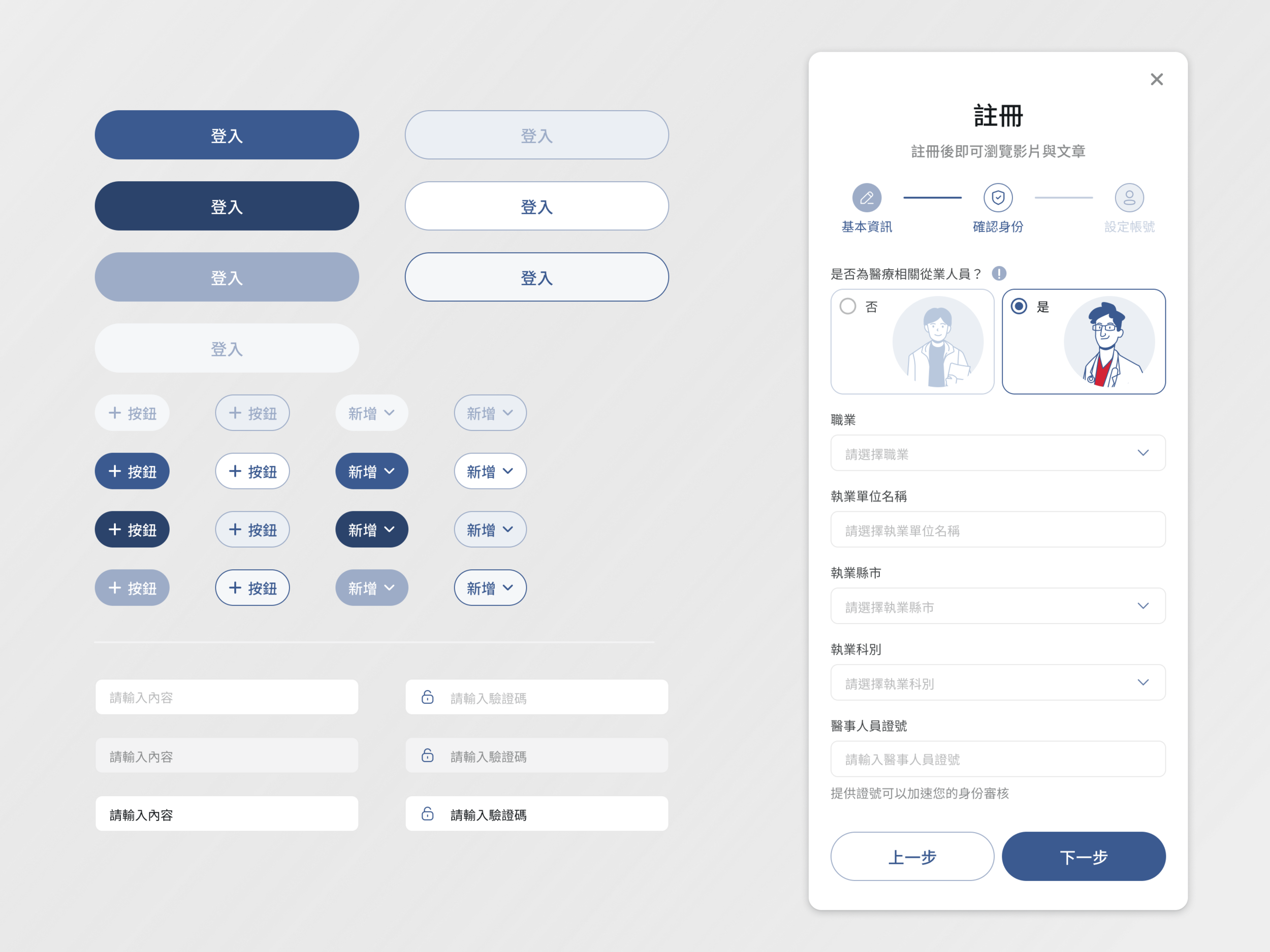
The aesthetics of rounded corners
Rounded corners look modern. The momentum of applying full rounded corners started from mobile and then expanded to web UIs. Round corners communicate a sense of simplicity, optimism, and openness.
Add illustration
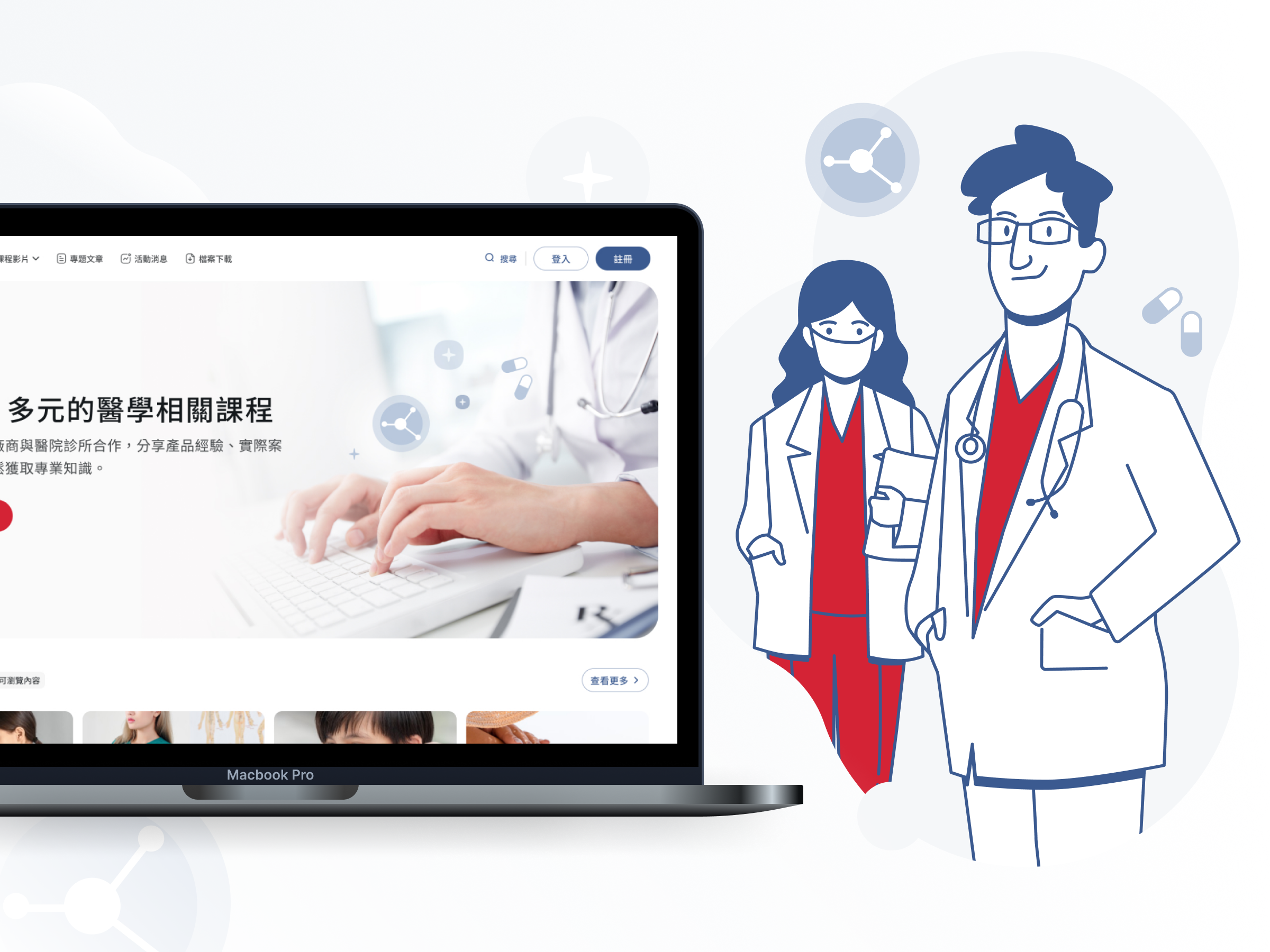
I designed according to the target users’ needs, they don’t want medical websites to feel unreachable, so I use customized illustrations to make the site stylistic consistent with the layout. And also makes illustrations highly effective in making a UI design recognizable and supports the website branding.
Customize Icons
To customize icons to let users notice and decode images quickly so illustrations icons used wisely can make the interactions simpler and faster.
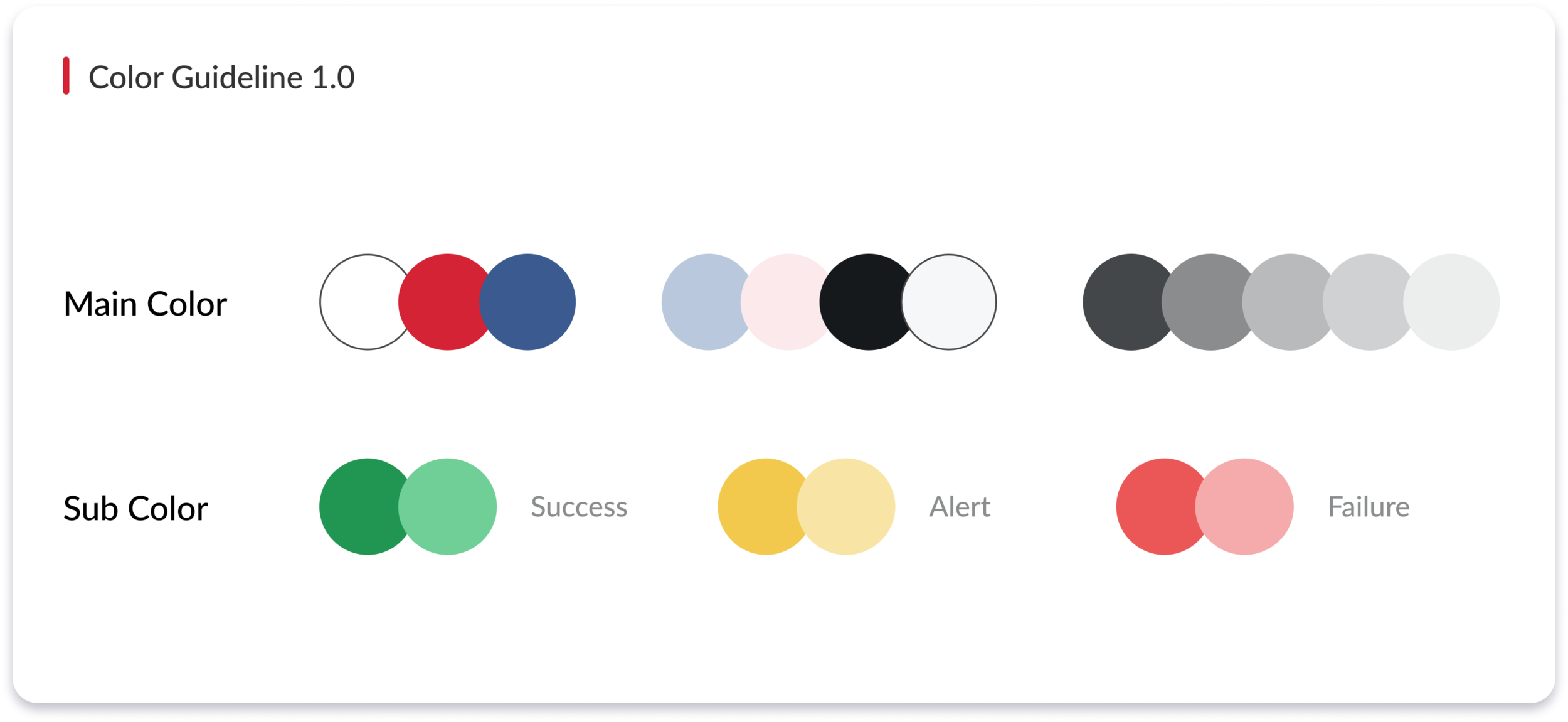
Color Palette for DKSH
Considering that this project is associated with education and also our users asked to design a “young and energetic” website, we decide to not use dark color at this phase. I created and defined the color for the website. We planned to have the detailed visual guideline in next phase.


