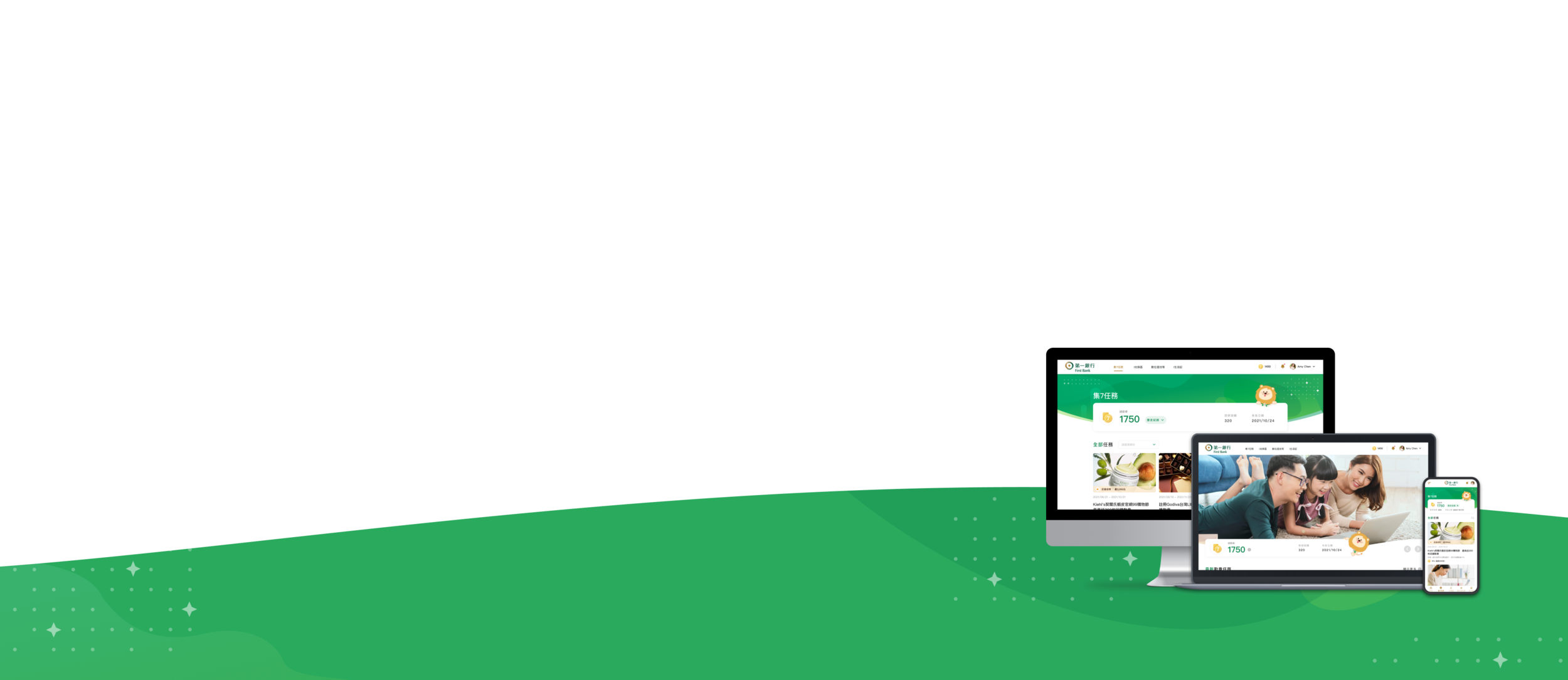
Online Points Platform
13th-27th Sept 2021, Proposal, Taipei
Why Do People Switch Banks? 🤔
Outside of the uncontrollable reasons customers switch, there are still a number of elements that banks can control, right?

Introduction 💬
This project hopes to offer products with more or better rewards, such as a point platform to increase the number of members and increase member loyalty. And members can use the points to save money and continue to redeem rewards, but also to establish brand added value for the cooperative stores on the platform.
ROLE
UI/UX Design
Illustrator
DELIVERIES
Proposal
Wireframes
User Interface
TEAM MEMBER
Thomas Lai (PM)
Andrey Wang (Agent)
Sean Wang (Design Lead)
Design Process

Design Goals
Based on preliminary interviews with stakeholders, we chose to design a point platform that strengthens users’ redemption goals. Through visual guidance and customized recommendations, we guide users to easily participate in platform tasks and increase users’ willingness to gather points. Thereby enhancing the user's adherence to the brand.

Design Strategy
Friendly guidance
Through classification and tags, users can easily explore the platform.
Customized experience
Provide a customized user experience based on the user’s banking content to assist users in judgment and decision-making.
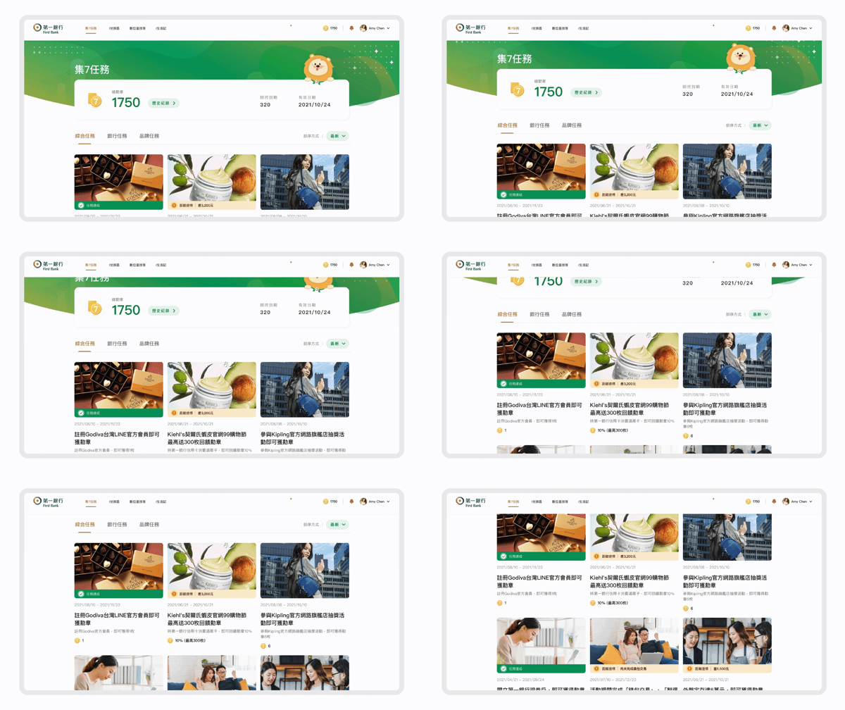
Wireframing ✍🏻
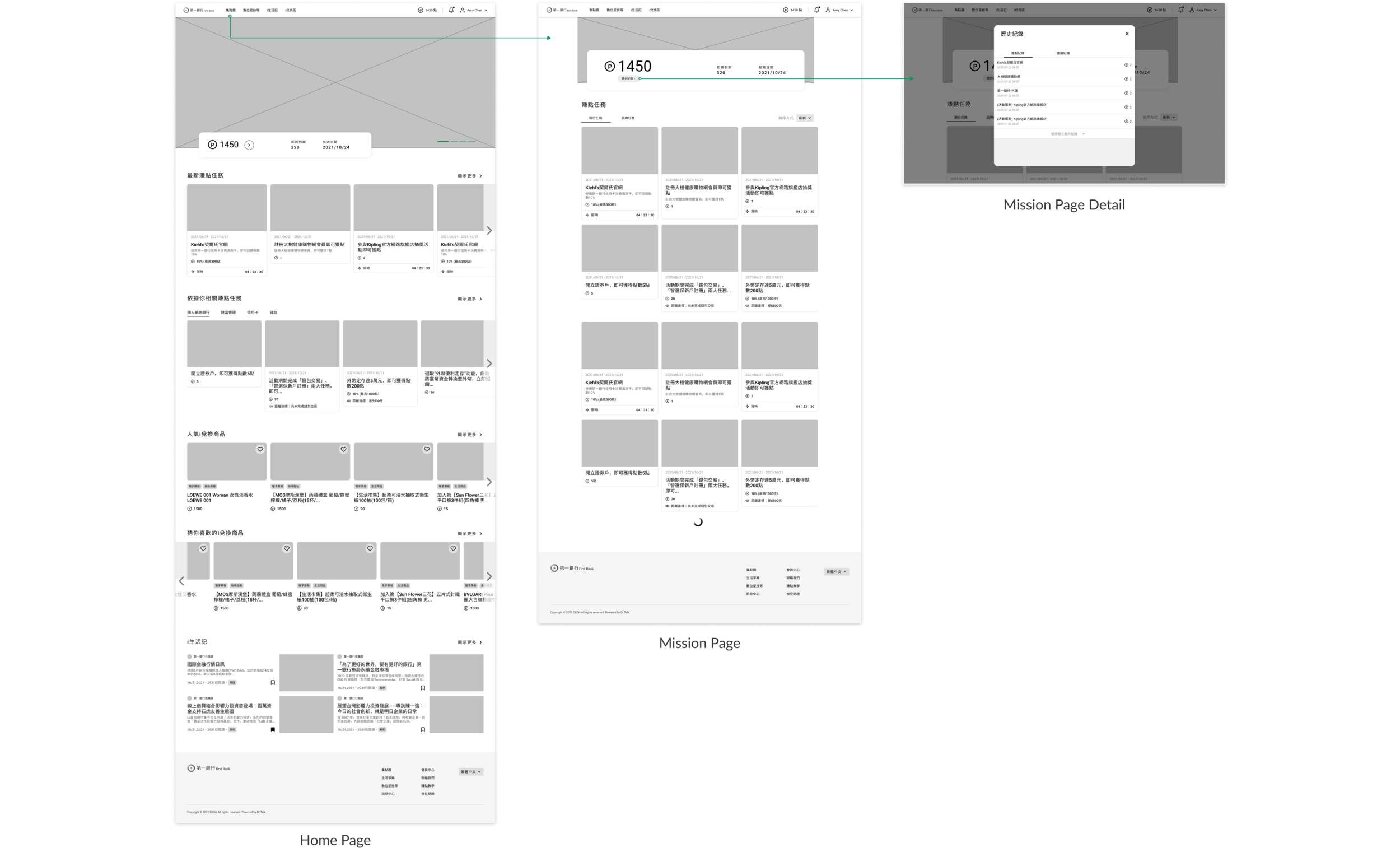
I created wireframes to discuss with engineers and project specialists to see if this design is feasible or not. Also, I could confirm if this design solves customers’ problems or not.
Final Results 💎
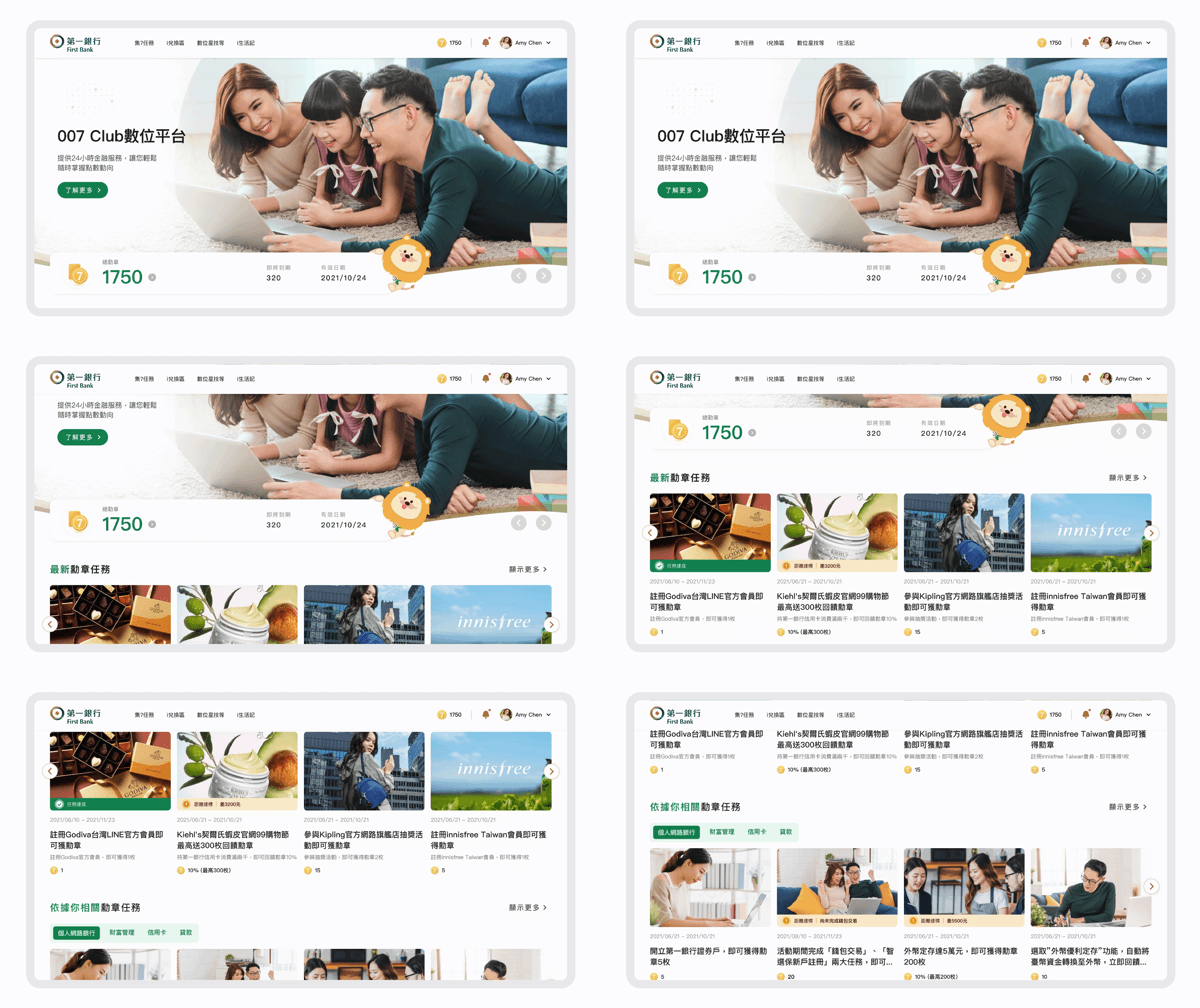
Making way for a whole new experience!After weeks of user research and iterations, we finally choose the home page and task page to optimize the design.
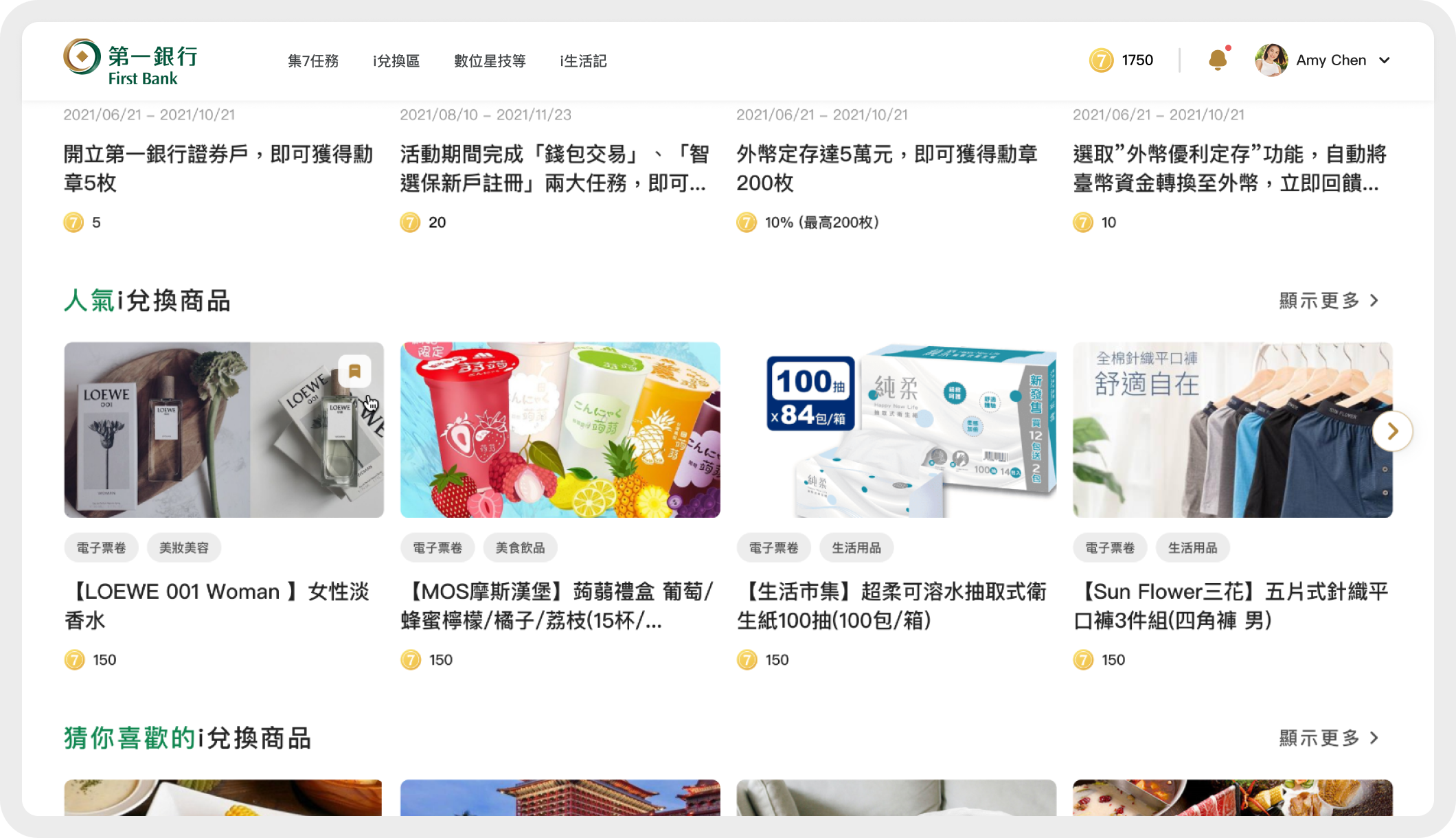
Home Page
Allow users to easily grasp the information, through the key information listed on the homepage and customized design.
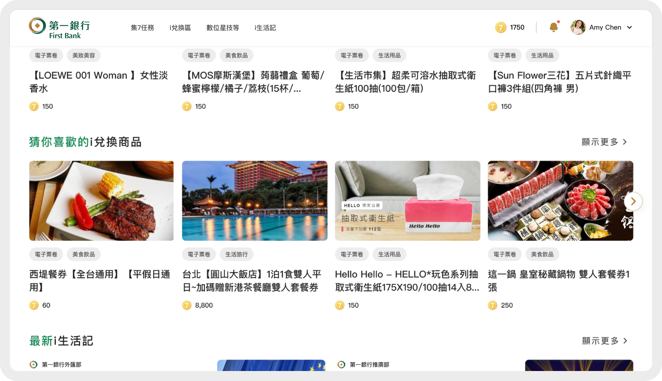
1️⃣ Customized experience: Guess you like it
According to the user's last redemption record, products of related categories are recommended to the user. Users can also redeem the goods they are interested in through the classification label.
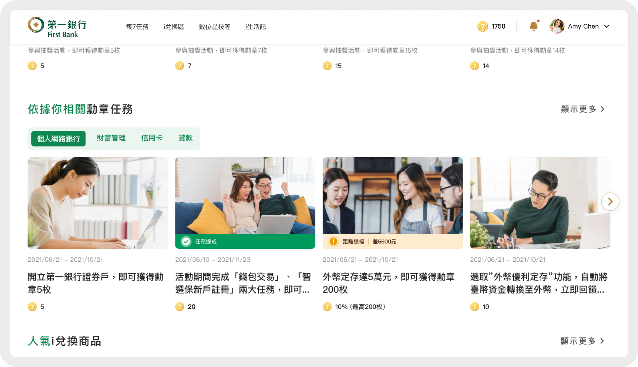
2️⃣ Customized experience: According to your relevant medal tasks
Here we display the tasks related to them through the user's banking business, and the user can also use Tab to switch what kind of banking tasks they want so that the user can experience a customized experience.
3️⃣ Friendly guidance: Popular redemption items
According to the psychology of users, we help users find the products they are interested in. Therefore, we provide friendly guidance to allow users to browse other people’s favorite products and provide them with a preliminary reference to see if they are also interested.
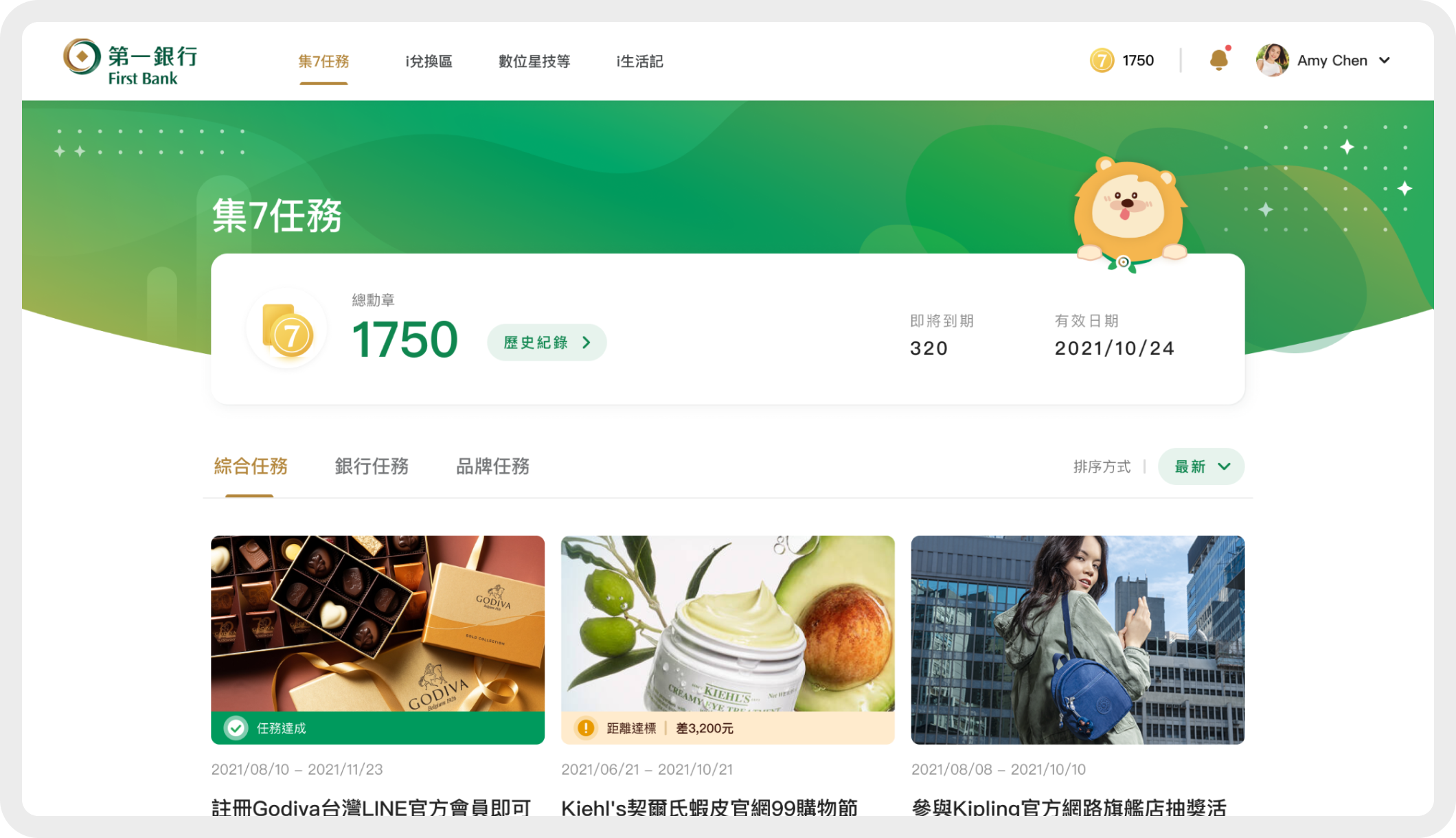
Mission Page
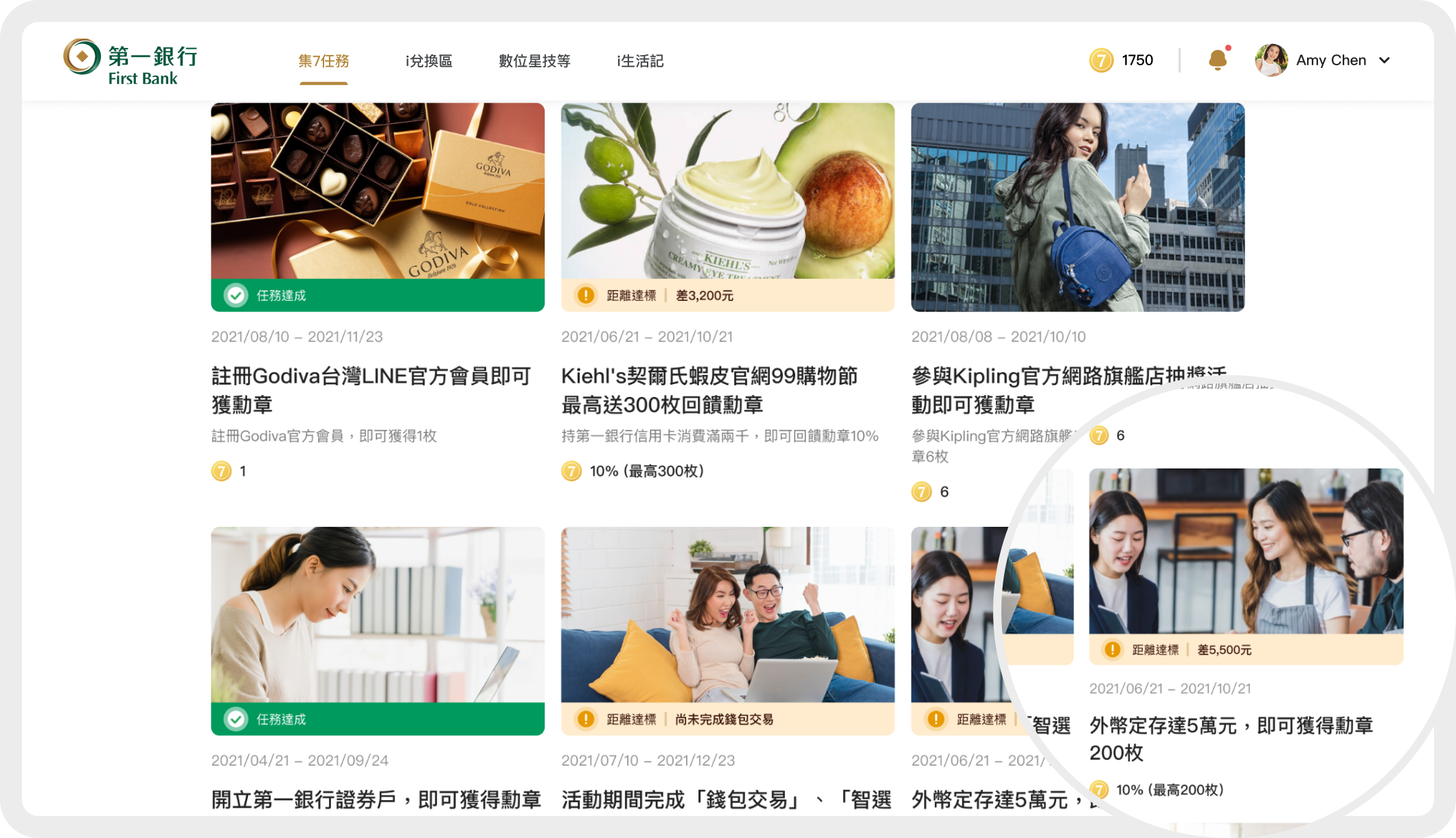
On the mission page, in addition to allowing users to easily find tasks they are interested in through Tabs, they can also master the details of their own medals in the Medal Center.
1️⃣ Customized experience: The Points Center
Here, the Medal Center allows users to grasp the status of the medal points in their hands. For example, the medal is about to expire, the date of expiration, then if the user wants to know more historical records, he can click the historical record button.
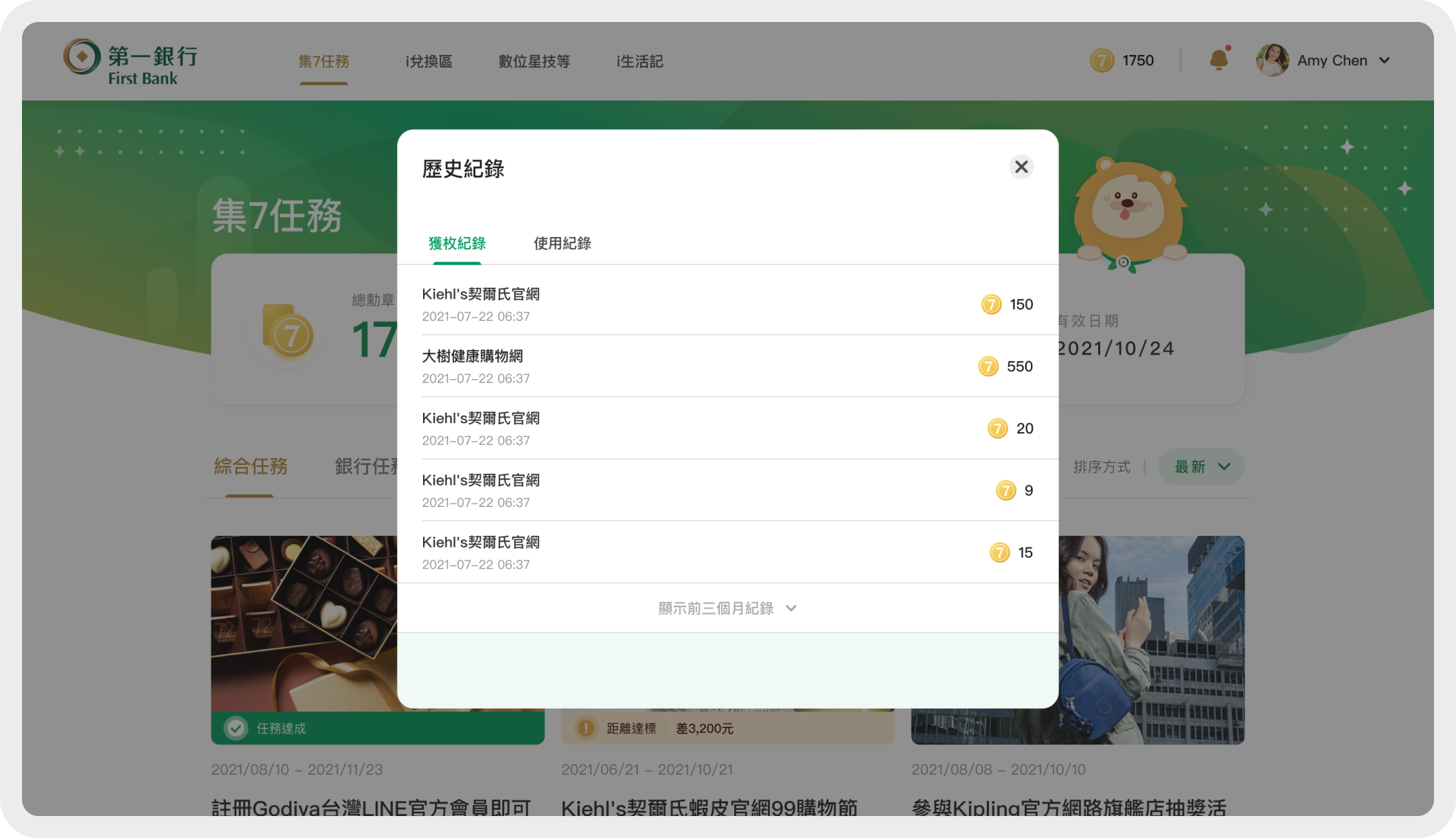
2️⃣ Customized experience: Historical record
Users can understand the source and use records of their medal points through historical records.
3️⃣ Customized experience: Mission card
In addition to displaying tag reminds the user's task progress, order the completed task card in front, allowing the user to protect the experience on the platform,
Purpose:
1. Let the user understand their task progress.
2. Do you want to choose this task to complete.

Key Takeaways 💡
Don’t be afraid of being criticized
Before the formal proposal, I had the opportunity to share my proposal with my company executives in person. They gave us very insightful feedback, but sometimes their honest feedback hurt. I once heard of a member who said, “This design may not be enough to reflect this brand sense” in person. It was hurt in the beginning, but then I asked her the reason. It was not as scary as I thought and also greatly help us iterate the final design.
Think from different users’ perspectives.
In the proposal stage, we understand user needs through the information provided by the contact person. we found out some non-IT professionals are not familiar with design, so they cannot understand our ideas. I learned to be more empathetic and explain my design without using too many professional words.
