Global Forex Mobile App
2020,Forex Design, Taipei
Overview
Regardless of whether the user is a forex trading teaching teacher, a forex trading beginner, or a forex trading expert, a good product that can quickly and clearly view the latest forex trading information and account management is very important. My task was to create a brand new and intuitive APP for ATFX from scratch (This app product is based on the ATFX RWD version extension.)
DELIVERIES
UX strategy, UI, High-fidelity Prototypes
ROLE
Product Designer
TEAM MEMBERS
Product Owner: Julia
UI Designer: Jasper Ye
Developer Lead: James Wang
Developer: Vic
Developer: Sudie Lin
QA: Cindy
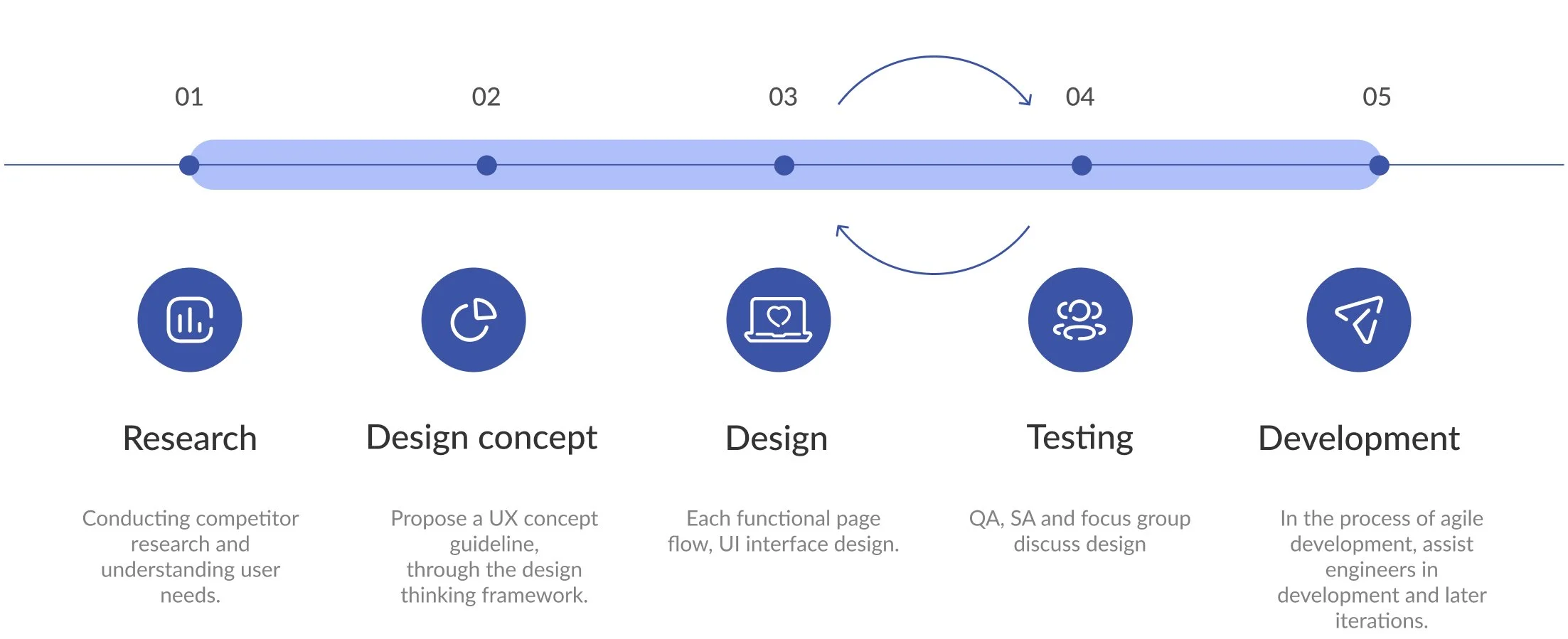
Design process
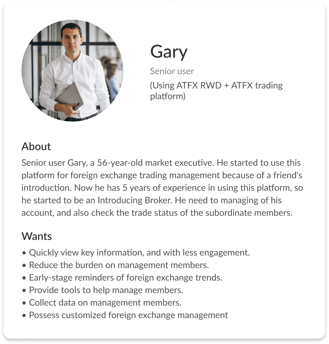
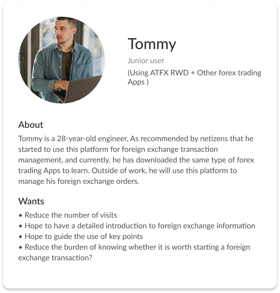
Persona
We developed these Persona based on feedback from 30 senior and junior users.
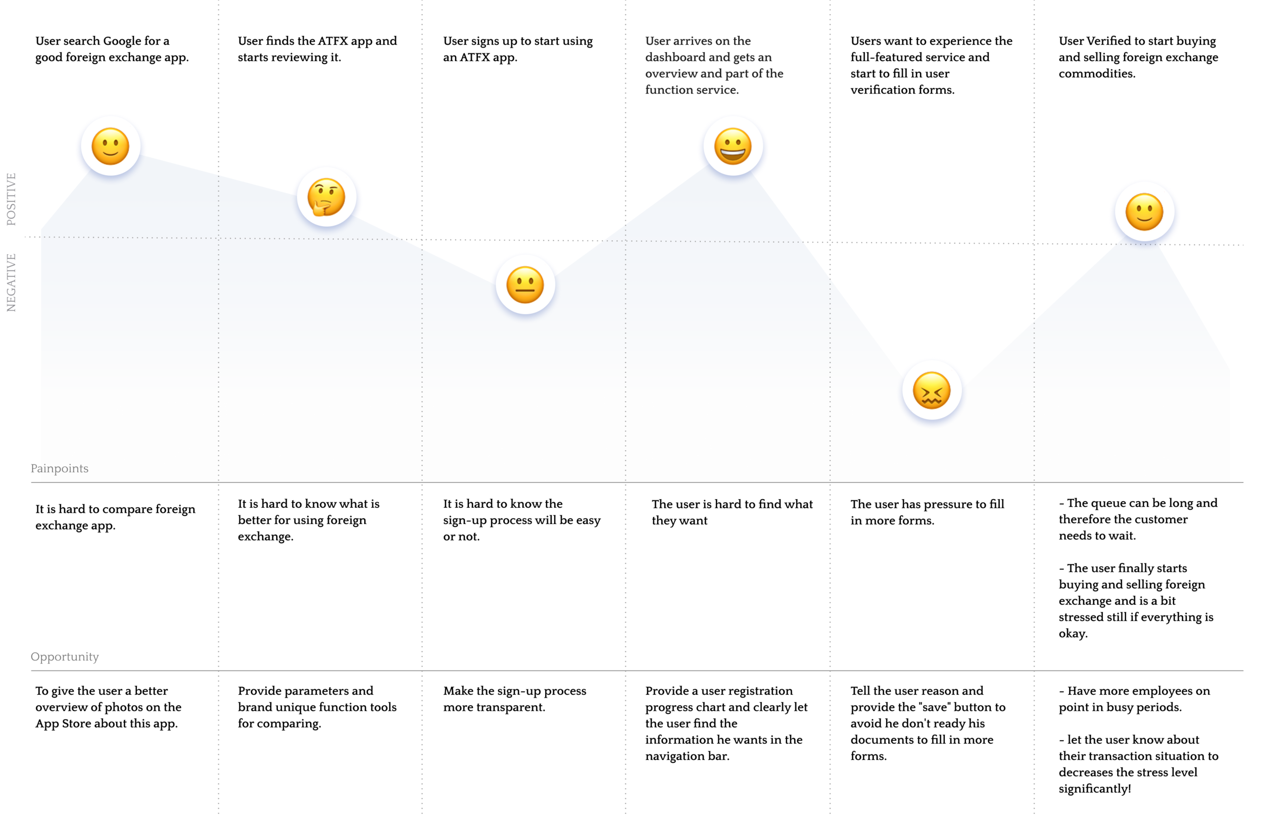
User journey
Here is an example of a user journey I came up with based on my research.
Challenges and goals
How to let users easily start using the foreign exchange trading APP?
Will the new app be more convenient to use than the existing RWD website?
Ideation
Login process
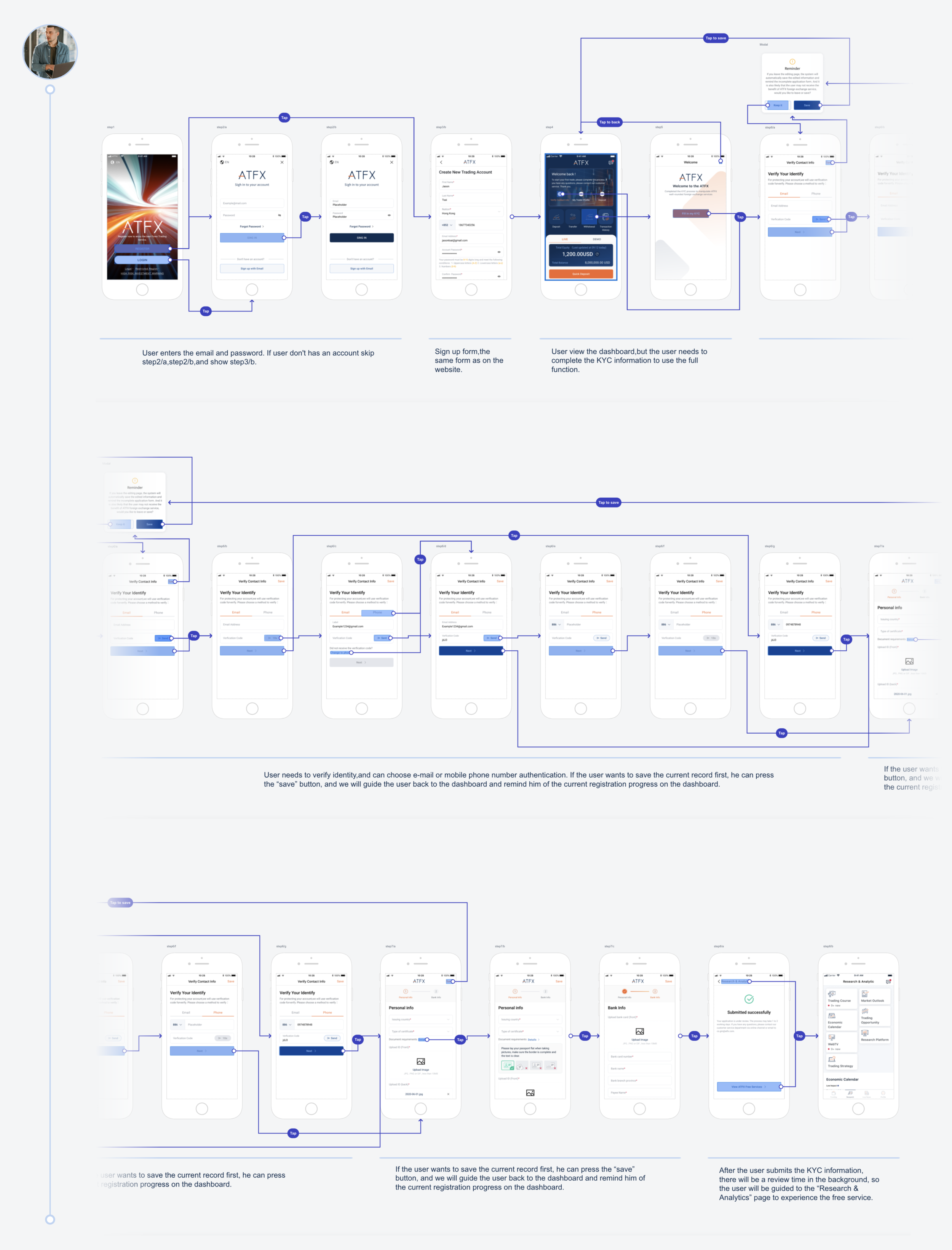
We redesigned the tedious process of registration at the beginning, and changed it to a process of segmented registration. This allows users to experience the basic foreign exchange functions in the APP first. For addition functions, users can complete the KYC form later.
Customized Settings
We let users customize their homepage according to their needs. For example, users can set their own shortcut buttons.
Intuitively menu
Through a simple and clear category menu, users can intuitively understand the relevant content and functions of the application.
Deliveries
Taking the registration process as one of the representatives, the key design is to reduce the time for users to register. You can enter the dashboard by filling in the basic information, and the detailed information can be filled in later.
Junior-user’s flow. (🌐 Provide online version)
Visual design
Dashboard
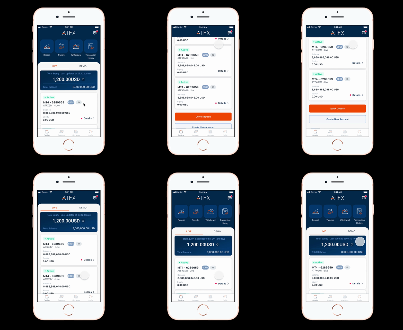
Dashboards like category pages, for this page I decided to use a grid layout to make it easier for people to navigate. Icons and card designs help to easily display and identify each category and funding information. Clicking on each category will take you to the specific category page. (🌐 Provide online version )
Dashboard of main ideas
A progress card will appear on the dashboard to alert the user.
Provides the user's shortcut ribbon.
Users can drag upwards to make the account area display a full-page, making it easier to read.
Research and Analysis
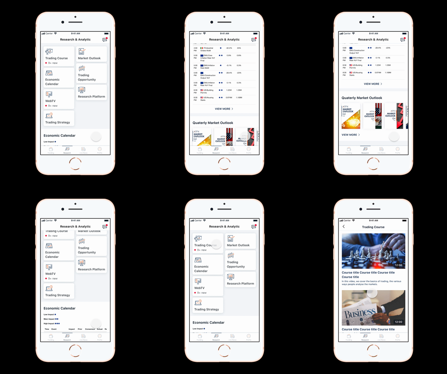
For this page, we help our users to discover and analyze new Forex opportunities, as well as keep up to date with financial markets.
Research and Analysis of main ideas
Levels down for exploration (up to three levels)
With customized icons, users can easily associate functions.
Notification Center
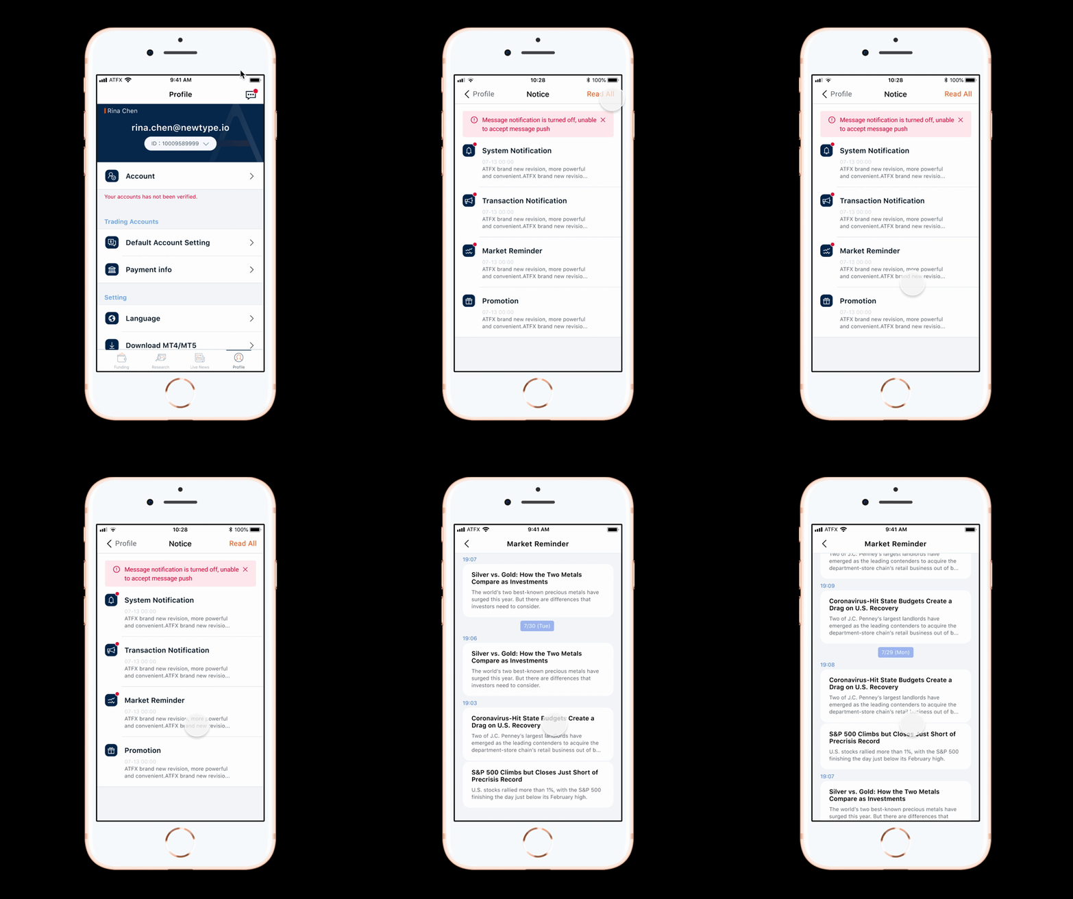
The notification center is a combination of four submenus. System Notification / Transaction Notification / Market Reminder /Promotion . I combine this so that users don't have to switch between menu to see their notifications.
Notification Center pages of main ideas
Message classification.
Sort information using time.
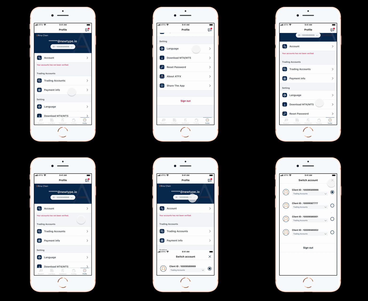
Profile -Setting pages
Profile pages of main ideas
Highlight the switch user account area.
Set information classification.
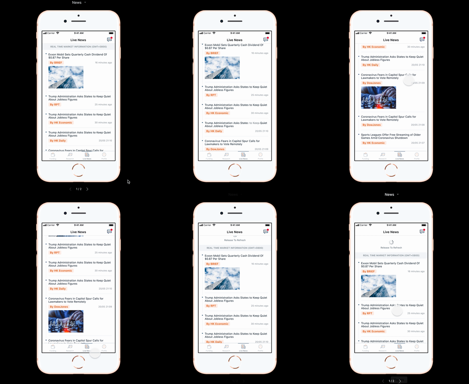
News
A news page where user mostly spends a lot of time to read on the app. So I decided to use big typography and proportional spacing is making it easy for people to read. And also I use the timeline to let users can get the latest information quickly, and in the read news detail page, add "Related reads" so we can pick for users to see relevant news they are interested in.
News pages of main ideas
Sort news information using time.
Use #Hashtag to categorize information sources.
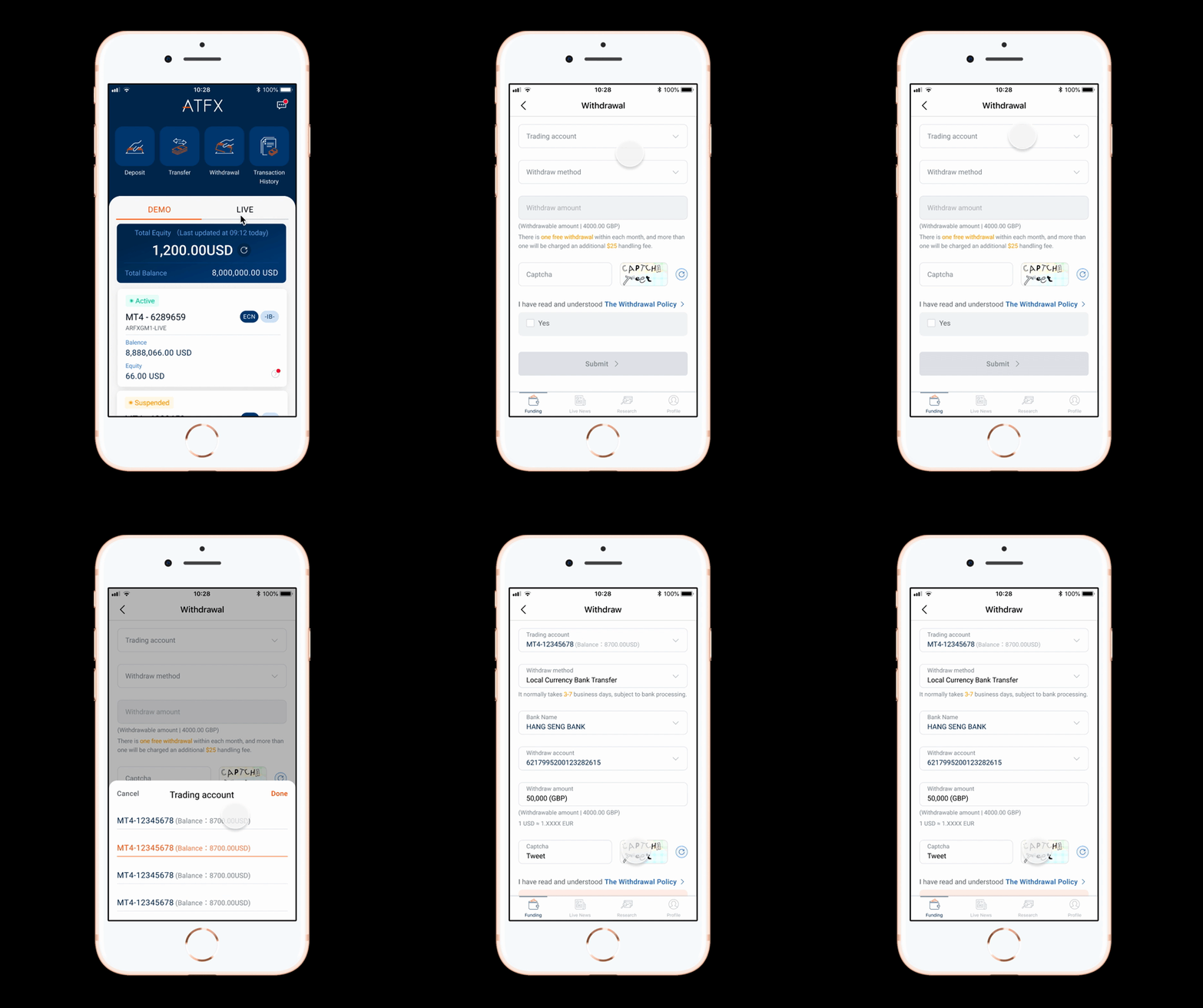
Fund pages - Withdrawal / Deposit / Transfer
Simplify the user's deposit, withdrawal, and transfer process pages. This page sets the default value of the account name, bank, or currency that users often use, so that users do not need to fill in the long-form content repeatedly to make transactions, speeding up user operations on this page and stay.
Fund pages of main ideas
Reduce the user's actions to fill out the form and choose their default information instead.
Result
Even though the app is still in beta, I consider it a success based on what I’ve heard from real users so far. 38 out of 50 App trial participants rate it very good, due to its user-friendly usability. The feedback has been very positive! App has already lined up some QA/QC engineers to pilot the app and they’ve received quite a bit of praise for the intuitiveness of the UI and UX. To be part of building a product from the ground up and seeing it grow into a platform where real people use it has been surreal. It’s been a team effort that has required constant communication between myself, the founder, and the engineers. To make people’s lives better through design, even if it’s just a little bit, is why I do what I do.
Officially online:2021/12 ( Currently the only open beta version )


